

DEPRESSION BIPOLAR
SUPPORT TAMPA BAY INC.
My role
Project Manager, UX/UI Designer, UX Researcher, Wireframing, Prototyping
Team
Adrienne Arthur, Emma Geiger, Karen Monroe, Ever Williams
The Depression Bipolar Support Tampa Bay, Inc. (DBS) is a vital resource for individuals with bipolar disorder. We redesigned the website to offer a more welcoming online experience, simplifying navigation and enhancing content.
Our goal is to empower individuals like Samantha to access necessary resources and community support effortlessly. Through remote collaboration, we created a website that embodies DBS's dedication to providing support and hope.
Client
Depression Bipolar Support Tampa Bay, Inc.
Duration
4 weeks, 6 Screens
Tools
Figma, Photoshop, Trello, Google Suites


Problem Statement
Samantha, recently diagnosed with Bipolar Type 2, is looking for belonging and understanding. She visits the Depression Bipolar Support Tampa Bay, Inc. (DBS) website for help but finds it confusing and overwhelming. The cluttered design and unclear information make it frustrating and unwelcoming. To better support people like Samantha, DBS needs to redesign its website to be clear, welcoming, and community-focused.
The Solution
Perform an evaluation of the website's usability, content, and functionality.
Analyze user data and insights to understand pain points and opportunities.
Simplify website navigation and information organization
Utilize scannable formats and concise language to improve comprehension.
Add engaging visuals and interactive elements to enhance user experience.
Design and Prototype
Our goal was to create a digital space that feels welcoming and supportive. By designing a responsive interface, we ensured that individuals can access essential resources and connect with the DBS community seamlessly, regardless of the device they use.

We created a detailed and comprehensive model of the new DBS Tampa’s website using Figma.


User Flow - Find Directions to where the South Tampa Support Group Meets via Meeting Map

Current State Evaluation
Navigation and Design
The color scheme and fonts make the UI feel outdated. The layout is inconsistent, with some sections feeling cluttered and others feeling empty. Navigating the UI can be clunky and confusing, with unclear information hierarchy.

Excessive Information
Dense, wordy paragraphs dominate the website's content, including below the fold. The lack of visual cues makes it challenging to navigate and identify key points. This text-heavy approach hinders the user experience throughout the site.

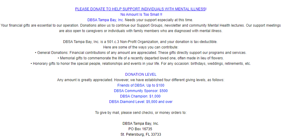
Donations
The donation information is hidden on the homepage, lost in a sea of text and competing elements. There's no clear hierarchy or visual cues to guide users towards giving, leading to frustration and abandonment.
Support Group Listings
Navigating the support group page feels uninspiring and provides minimal details about individual meet-ups and no clear links to more information. The absence of directions adds another layer of difficulty for anyone hoping to participate.

Inital Recomendations
Modernize Design: Refresh the design and color scheme for a more welcoming and engaging appearance.
Information Architecture: Reorganize content for clarity and confidence in accessing resources.
Accessibility Enhancements: Enhance the website's user-friendliness for easy access to support resources.
Reduce Clutter: Break up lengthy text blocks into shorter paragraphs with clear headings and subheadings. Use bullet point lists to highlight key information.
Dedicated "Donate" Page: Create a separate page that provides detailed information about donation options, methods, and impact. Link to this page prominently from the global navigation of the website.
Pain Points and User Observations
Unclear links and cluttered layout hindered website exploration.
Text-heavy pages lacked engaging images or infographics for
effective scan-ability.Lack of definitions for key terms like "bipolar disorder" and "depression."
Dated website layout and visuals, perceived as outdated and unprofessional.
We interviewed and tested with four users using the initial website design. We posed questions and tasks based on our heuristic evaluations of the website.
User Research

50% of users found meeting info for South Tampa support group meet up.

50% of users located the Aiken Memorial Library landing page.

25% of users successfully found information on how to donate to the DBS.

25% of users were able to navigate back to the Home Page.
How might we improve the design so that users can find information and resources more efficiently?

Information Architecture
Reorganize content in a card sort and create a site map.
Avoid unnecessary clutter and prioritize relevancy.

Update Design
Incorporate visual elements and headings that accurately reflect the section's content.
Create a more welcoming and engaging aesthetic appearance.

Streamline Accessibility
Simplify navigation with intuitive breadcrumbs and contextual menus.
Streamline user flows with intuitive navigation and visuals cues that guide users.

Informed by the results of our card sort, we created a site map for our redesign with established and new features. This guided us and kept us all on the same page when designing our delegated projects for the website.
Site Mapping

We developed a low-fi home page wireframe to conceptualize the direction we will go. As the project evolved, some features were added, removed, or altered.
Low-Fi Wireframe
We evaluated our first high-fidelity prototype of the new DBS Website by having four users complete specific tasks and provide feedback.
User Testing High-fi Design

Testing Results and Observations
Participants praised the navigation for its ease and clarity.
Some users got confused by the "Library" and "Articles" Tab.
Positive comments about the overall design and aesthetic.
Users felt empowered and efficient thanks to the site's intuitive design.

100 % found out when and where the support group meets for South Tampa.

75% successfully located the Donation landing page and donated money.
50% found a catalog of mental health resources about Bipolar Disorder.

75% located the calendar of DBS community events and meetings.
Improvements Based on User Feedback

We bolded and capitalized the "Donate" button to grab attention and make it easier for users to complete their donations.
Donate Button

To improve usability, we redesigned the library and articles sub-navigation tabs on the “Recourses” landing page to be more compact and direct.
Library and Articles Tab
We collaborated in Figma to create beautiful, responsive website wireframes for the DBS, informed by user research and personas. We emphasized visuals for clarity and user-friendliness.
Wireframes
Desktop

Mobile


Results and Findings
Latest iteration received overwhelmingly positive feedback.
Streamlining information is crucial for optimal user experience.
A visually striking website fosters trust and professionalism.
Visual cues act as intuitive guideposts, simplifying user journeys.
Proactive testing uncovers hidden pain points, leading to a smoother user experience.
Next Iteration
Complete more user testing with our design.
Add links to social media sites, such as the DBS Facebook page.
Make the design more consistent.
Conduct user research on more pages and user-flows.
Continue development of the mobile version.