
WYOMING
Department of Revenue
Web Design and Enhancing Visual Clarity
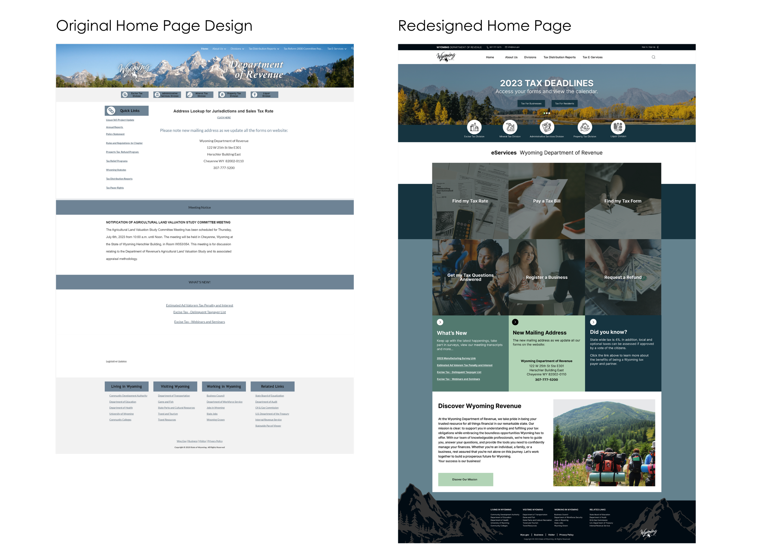
We redesigned the Department of Revenue website to better assist Wyoming residents, including newcomers like Alba. The new interface uses simple language, and visual cues. It is now easier to find important tax information, which helps reduce stress during filing. Our team created a website that supports new and established residents for a positive tax experience.
Tools
Figma, Photoshop, Trello, Google Suites


My role
UX/UI Designer, UX Researcher, Wireframing, Prototyping
Team
Meghan Driscoll, Ever Williams, Anne-Marie Kildron
Client
Wyoming Department of Revenue
Duration
4 weeks, 9 screens

Problem Statement
Alba, a recent Wyoming transplant, is overwhelmed by the complexity of filing her first state tax return. The Wyoming Department of Revenue's website, with its confusing layout and complex language, increases her anxiety and makes it difficult to complete this important task. A full redesign is needed to make a user-friendly platform that helps users like Alba fill out their taxes with confidence and ease.
The Solution
Conduct a comprehensive review of the current website.
Assess and prioritize user needs and objectives.
Develop a user-friendly prototype to address pain points and obstacles.
Implement improved navigation for smoother user experiences.
Enhance the website to help the seamless completion of tax-related tasks.


I created the new global navigation for desktop using Figma, utilizing visuals to guide users and avoid sole reliance on jargon.


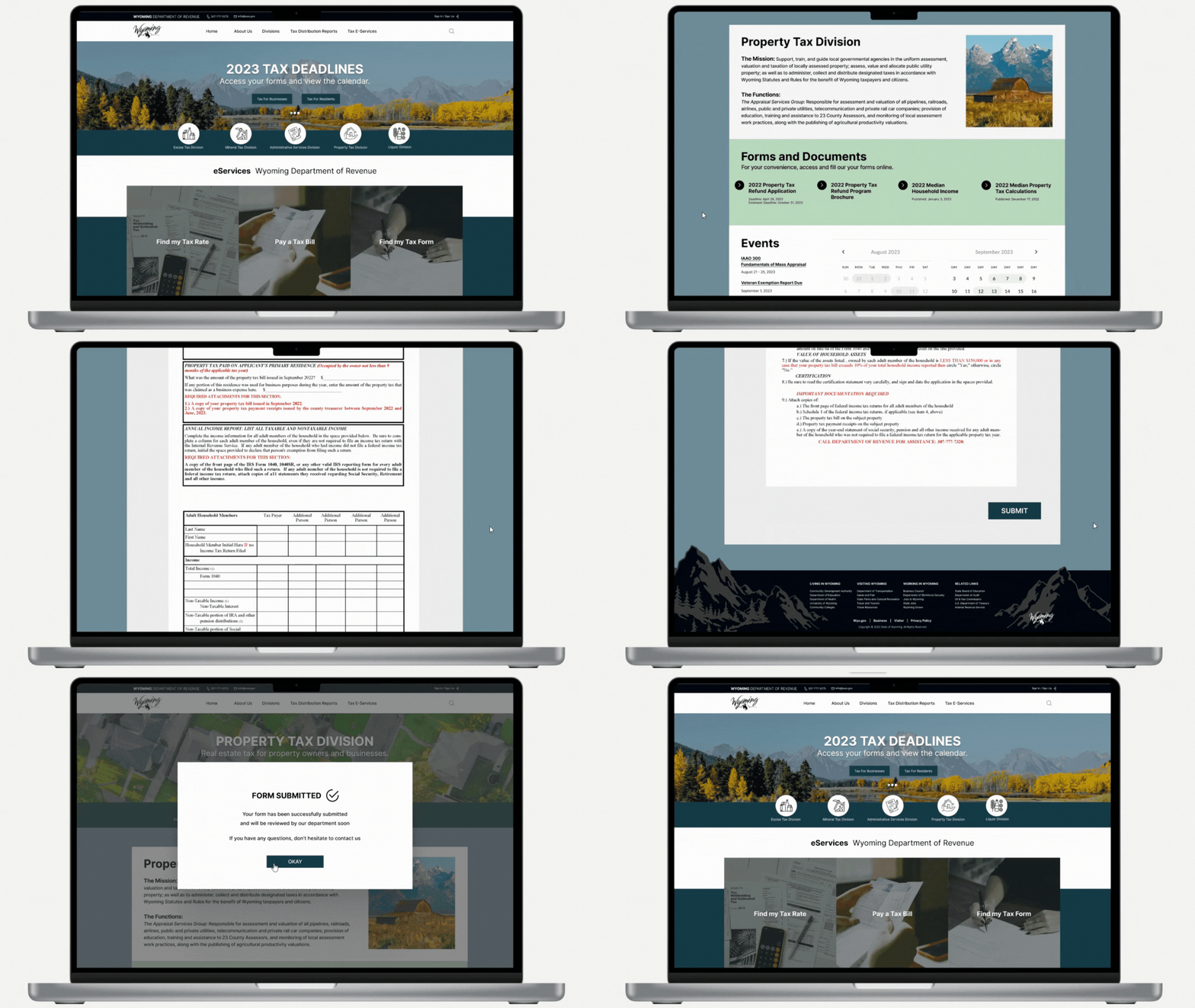
User Flow: Find and submit the 2022 Property Tax Refund Application
Current State Evaluation
Navigation and Design
Cumbersome navigation, excessive white space, and an underwhelming layout combine to create a frustrating user experience for completing the 2022 property tax return.

Links and Buttons
Some interface elements mimic clickable buttons but aren't, causing user confusion. The inconsistent navigation design further hinders usability. While the small icons below the fold are a good idea, their legibility could be improved.

Global Navigation
The overcrowded navigation bar's excessive links and truncated titles contribute to user frustration and impede efficient navigation. The low contrast between white text and a pale blue background hinders readability, especially for visually impaired users or those in varying lighting conditions.

Property Tax Division Page
The Property Tax Division page's different design may confuse users. Despite the jarring design difference, it shares similar issues with other landing pages.

Inital Recomendations
Streamline Navigation: Simplify the navigation bar and interaction flows for user-friendliness.
Design Coherence: Align the overall design with the rest of the website for consistency.
Content Alignment: Ensure the page's content matches the website's purpose and design.
Accessibility Enhancements: Improve accessibility with features like easy-to-spot links, clear visuals, and simple language.
User Pain Points and Testing Observations
Struggled with website navigation and language used.
Frustrated with lack of clear buttons and links.
Suggested direct link to forms.
Frustration with non-functional 'home' buttons.
Difficulty finding required form.
We interviewed and tested with six users using the initial website design. We posed questions and tasks based on our heuristic evaluations of the initial website, with the main task being to find the 2022 Property Tax Refund Application.
User Research

33.3% of users found the “2022 Property Tax Refund Application” without help.

50% of users located the contact info for the Wyoming Department of Revenue.

100% of users did not know the words used on the website, like “Excise Tax.”

33.3% of users were successfully able to navigate back to the Home Page.
How might we enhance navigation and information architecture?

Filter and Sort Content
Sift through website’s content to streamline usability.
Reorganize content in a card sort and create a site map.

Consistent and Clear Design
Design landing pages to be harmonious and visually appealingly.
Add visual cues to guide users through the design.

Optimize Findability
Create direct and clear links for users to find with ease.
Implement intuitive interaction design to help users complete their goals.
Site Mapping

Our site map guided the development of key pages, features, and navigation for the new website. By prioritizing user experience, we crafted a site map based on the card sort we conducted. The site map ensures easy navigation and streamlined information architecture.

We collaborated in Figma to create beautiful, responsive website wireframes for Wyoming, informed by user research and personas. We emphasized visuals for clarity and user-friendliness.
Wireframes
Desktop
Confirmation Overlays


Tablet
Mobile


Before and After


Results and Findings
Testing our redesign iteration resulted in a 100% success rate for locating the “2022 Property Tax Refund Application” without help.
The design process for a government site needs to be approached differently than a non-government agency or client.
Consistent brand identity is important in executing a cohesive and intuitively navigable website.
Prioritize the features that are most critical to improve first.
Next Iteration
Continue designing more landing pages.
Add more interactions to prototype.
Add “upload” option for forms.
Conduct more user research on other landing pages.
Iterative testing for refined insights.

