

FRONTPOINT
Security and Smart Home Devices
App Design and Intuitive Navigation
Busy working moms like Miranda often struggle with complex security systems. Recognizing shared user pain points, we redesigned the FrontPoint app to prioritize user experience and efficiency. This case study explores how a collaborative remote design process transformed a complex interface into an intuitive platform.
Tools
Figma, Photoshop, Trello, Google Suites


My role
Project Manager, UX/UI Designer, UX Researcher, Wireframing, Prototyping
Team
Luzeana Alfonzo, Meghan Driscoll, Austen Kelsall, Alejandra Panes, Ever Williams
Client
FrontPoint
Duration
4 weeks, 15+ screens

Problem Statement
Miranda, a busy working mom, felt a constant weight of worry due to her security system's complex and confusing app. FrontPoint’s current interface created accessibility barriers, wasted precious time, and eroded user trust. We knew we had to transform this experience, not just for Miranda, but for all users struggling to navigate their smart home security and device management.
The Solution
Perform a comprehensive review of the current app.
Conduct research to understand user needs.
Enhance visual clarity and reduce user fatigue.
Design navigation that allows users to easily find the features they need.
Prioritize user needs and preferences throughout the design process.
Design and Prototyping
We created a detailed and comprehensive model of the new FrontPoint App design using Figma.
We've created an easy-to-use experience that simplifies how users navigate. With three clear paths and straightforward navigation indicators, we help users like Miranda feel confident and in control.

Visual Walkthrough


Simple and Secure System
This user flow is designed for safety and convenience, outlining the steps to arm or disarm the security system. It removes extra complications and offers clear visuals, making the process straightforward and reassuring.


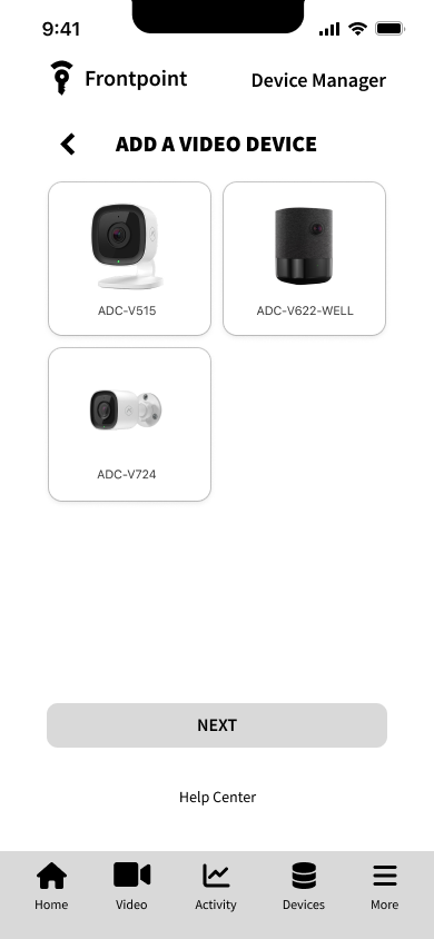
We've outlined how a user can easily add a new device to their security system. By simplifying the process into clear steps and offering easy-to-follow guidance, we've made setup frustration-free.
Streamlined Device Onboarding

This flow guides users to customize their home's comfort by adjusting temperatures and creating schedules. We’ve streamlined these tasks, empowering homeowners to improve energy efficiency and enhance their living experience.
Effortless Climate Control

Limited access to the Frontpoint app greatly hindered our user research. Since the product is related to physical security and smart home devices that require purchase, the app's restricted availability made thorough usability testing difficult.
The Problem
Project Challenges and Solutions
To overcome this limitation, we adopted a two-pronged strategy:
Heuristic Evaluation: We carefully evaluated the Frontpoint app to find usability issues and design patterns. This analysis revealed important information about the app's strengths and weaknesses.
User Interviews: We spoke with people who use different security systems and smart home apps to learn about their needs and expectations. Through their experiences, we identified common problems, preferences, and desired features.
Our Approach
Heuristic Evaluation
Evaluation of the original app's usability design to see what is effective and what isn't.
Home Screen
The home screen's focus on dropdown menus prioritizes organization over clarity. This approach makes features less accessible, harder to understand, and slows down users' ability to navigate the dashboard efficiently.


System Arming
Iconography and labels could be optimized for better clarity, further strengthening the system arming.
Thermostat Schedule
The thermostat schedule editor is overwhelming and confusing. It’s difficult to see and visualize the full schedule, hindering ability to edit.

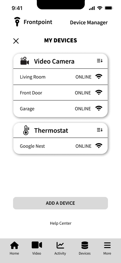
Device Manager
Crowded navigation and text heavy device manager screen.

Initial Recommendations
Home screen with focus: Fewer elements, faster navigation, easier access to essential features.
Intuitive iconography: Visuals guide users through the interface.
Simplified interfaces: Reimagined screens like the thermostat and editor for clarity and ease.
Enhanced organization: Information on screens like the device manager to be reorganized for better findability.
Improved Accessibility: Clear design for inclusivity, ensuring everyone feels welcome and empowered.
We conducted in-depth interviews with five individuals to gather insights into their current security system usage and their expectations for an ideal security system and smart home device app.
User Research
Interviews Observations
Emphasized importance of ease of use and setup.
Users would be confused about navigating their security apps.
Users would like to have a simplified mobile experience.
Remote management of devices is a sought-after feature.
“I want to see a more streamlined and user-friendly navigation.”
“I don’t use all the features because I get confused on the app.”
User Empathy Map

How might we make intuitive feature navigation and integration on mobile?

Optimize User Navigation
Use clear visual cues like icons and labels for all navigation elements.
Avoid overloading the navigation with too many options.

Glance-and-Go Dashboard
Design features must be clear, easy to read, and user-friendly.
Allow users to personalize their home screen by selecting and rearranging features to suite their unique needs.

Streamline Mobile Function
Avoid unnecessary clutter and prioritize functionality relevant to the user's needs and wants.
Integrate features that help FrontPoint users achieve their goals.
User Testing Mid-Fi Iteration

We tested five users to gather feedback and insight on our mid-fi redesigned prototype of FrontPoint’s app.


Test Results and Observations
General comments were very positive.
Users noted they found the design pleasing and instinctive to navigate.
User requested a "Schedule" indicator on the thermostat card to further clarity.
Bell icon should be added for easy to find notifications.

80% of users successfully armed the FrontPoint security system

100% of users successfully navigated back to the home screen

100% of users set up a new ADC-B622-WELL video device

80% of users successfully edited thermostat sequence.
Improvements Based on User Testing
Enhanced user experience and visibility of notifications by adding an "Alerts" button on the dashboard for quick access to all notifications.

Redesigned the thermostat card to make it easier to use and understand by adding visuals such as a
clear title
schedule status indicator
color-coded thermometer modes
Improved user clarity and device identification by showing the device name entered during setup as a clear visual sign of the active device.

Hi-Fi Wireframes

Informed by our research and insight from my teammates, I transformed the wireframes in Figma, implementing high-fidelity visuals and functionality.
Side-by-Side Comparison


Results and Findings
Overall, the user testing for our design was positive.
Provide clear visual cues to indicate the current mode and status of schedules for thermostat homepage cards.
Streamline the layout and use clear, concise language to create an improved user-friendly experience.
Next Iteration
Add more schedule customization options.
Develop other features, screens, and sequences within the app, such as the video feed screens.
Iterative testing for refined insights.
Conduct more user research.